This is a demo store. No orders will be fulfilled.
Grid & Spacing
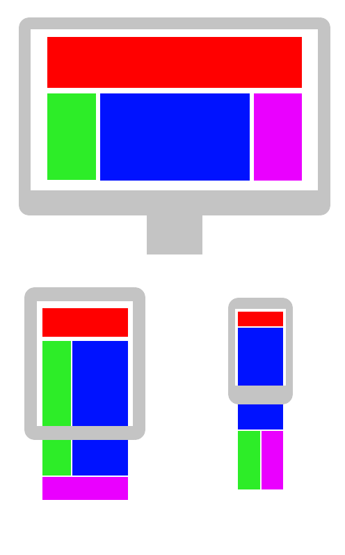
Responsive Design
Responsive web design (RWD) is an approach to web design that makes web pages render well on a variety of devices and window or screen sizes.
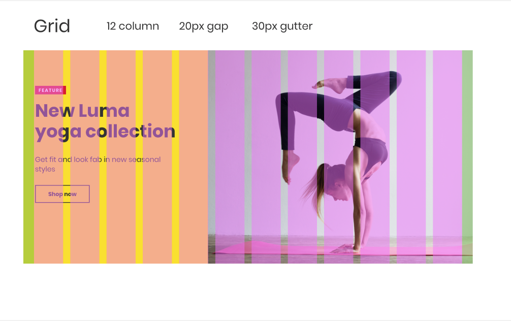
Grid
Your Design System will have an underlying grid upon which all elements will exist. Content can span one or more columns on the grid. Columns are alloted padding as specified below.
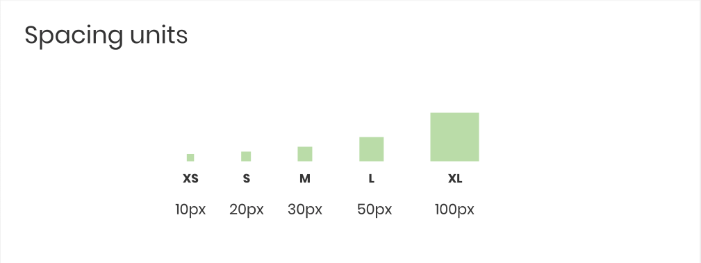
Spacing
Spacing units are for reference in your Design System. If you need to specify 'this needs to be closer' or 'the margins should be larger', specify one of the sizes below to maintain visual consistency.