This is a demo store. No orders will be fulfilled.
Style Guide Header
Mobile Header and Navigation
Mobile menu is collapsed with a hamburger menu icon.
The logo is added through the admin panel with an option to set a height and width.
Search and Mini Cart logo expand ( see below ).
Icon color - #757575
Icon color hover - #333333
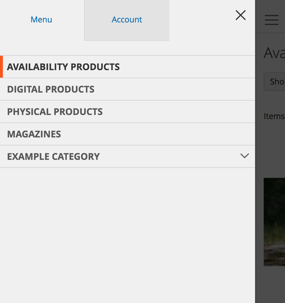
Top Level Links :
background:#f0f0f0;
border-top: 1px solid #d1d1d1;
color: #575757;
font-size: 1.6rem;
font-weight: 700;
margin: 0;
padding: 8px 40px 8px 15px;
text-transform: uppercase;
word-wrap: break-word;
Hover: color: #333333;
Active: border-color: #ff5501;
Account tab: background: #e3e3e3;
Menu - background-color: #f0f0f0;
Link hover - color:#333333;
Link active - border-color:#ff5501;
Account Tab - background:#e3e3e3;
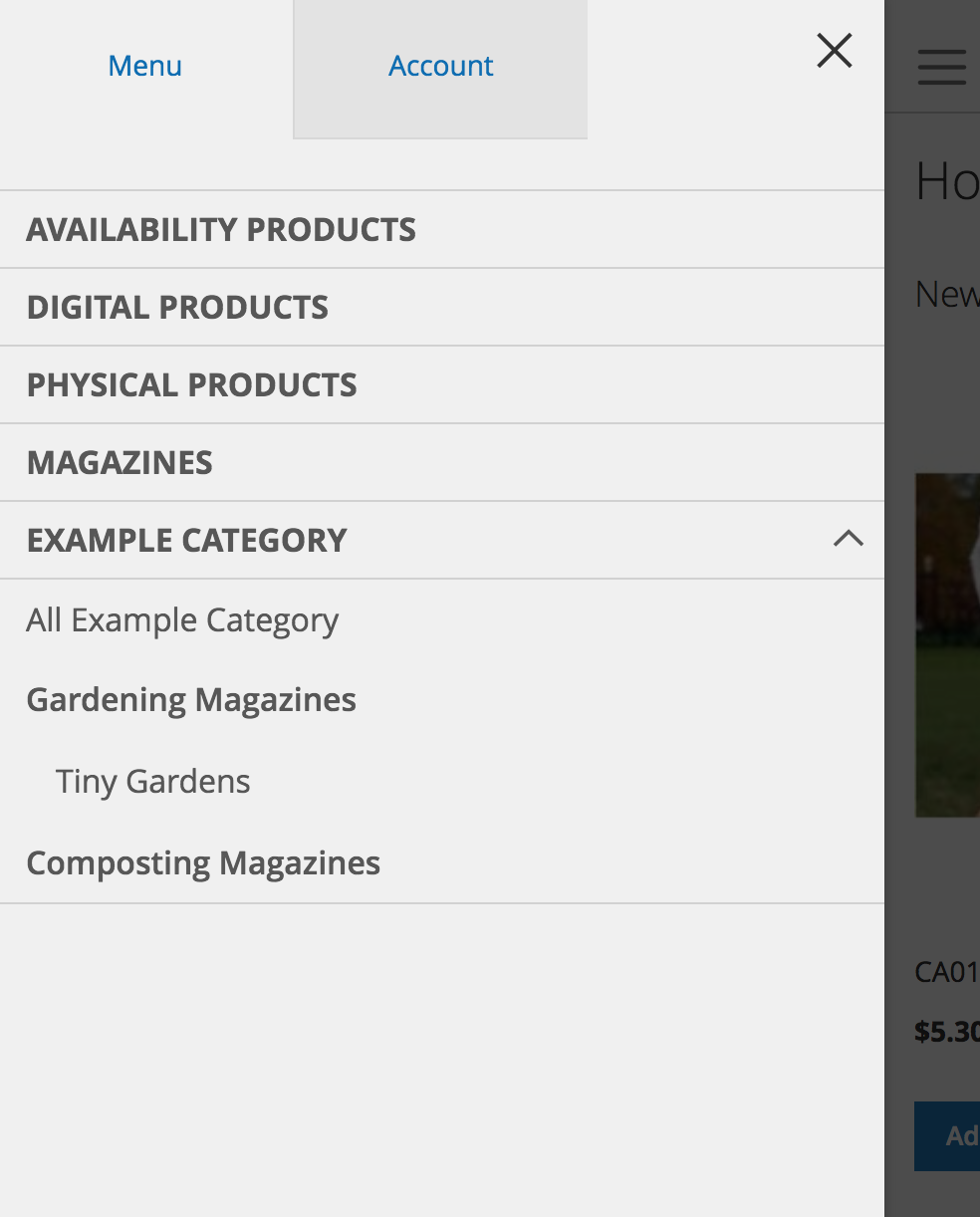
Top Level Expanded :
General styles still apply.
A link to all products in that category will be created and used only on the mobile viewport.
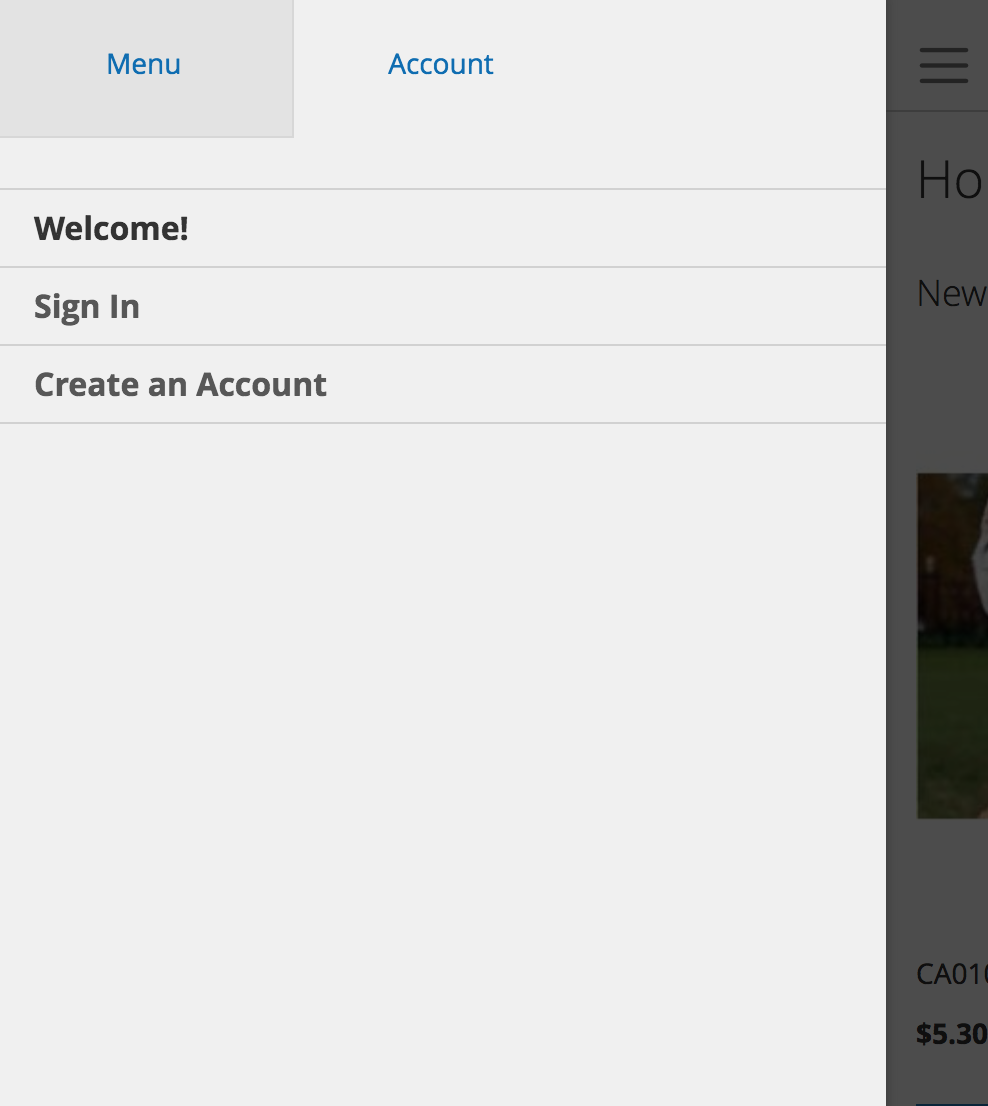
Account Tab:
Welcome! is a message that can be changed in the admin panel.
Styles follow the same color and styles as main navigation, minus the text being in uppercase.
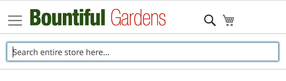
Mobile Search -
Clicking the search icon will pop up a search bar below the logo area.
Full search bar shows at 768px.
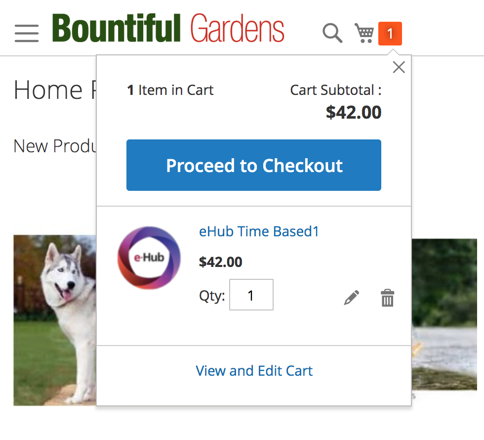
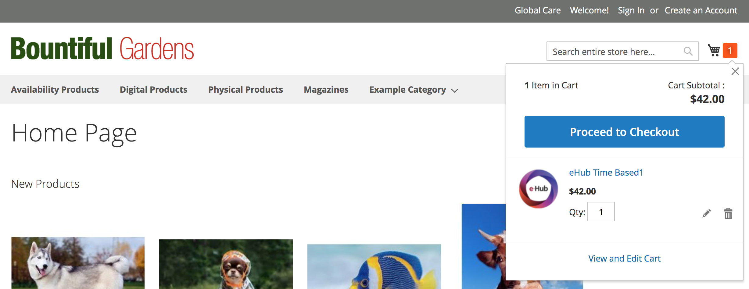
Mobile Mini Cart -
Once the customer has added products the number of products in their cart will display.
background: #ff5501;
Mini Cart Number - background:#ff5501;
Mini cart includes a primary styled button to proceed to checkout. Each product displays an image, title, amount, and some edit options to adjust the items in the cart.
Desktop Header and Navigation
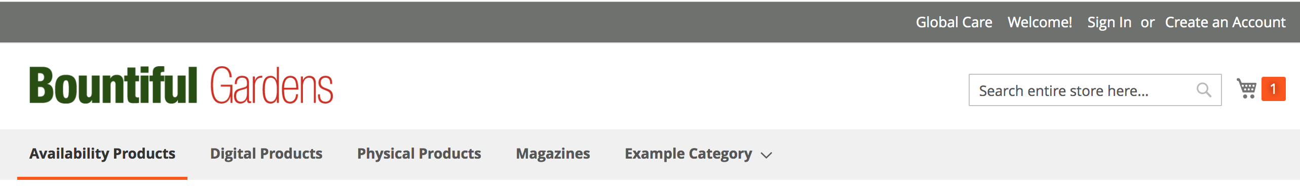
Desktop:
color: #575757;
line-height: 47px;
padding: 0 12px;
text-decoration: none;
box-sizing: border-box;
position: relative;
display: inline-block;
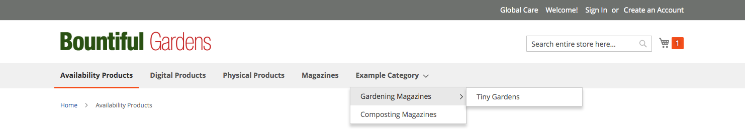
Desktop menu expanded:
On hover category pages show with a flyout style of menu.
Flyout hover - background:#e8e8e8;
Desktop Mini Cart:
Same styling and content as mobile version.